One of the main pillars of your brand is having a well-rounded color palette. But how the heck do you pick colors that represent your brand? And how many should you choose? And what about picking colors that go well together? All great questions my friend.
With every branding project, I hand-pick a set of colors that will serve the business well in the long term, not just something that’s uber-trendy right now. And while it’s not easy to nail down the precise colors, there is a method to the madness!
In this post, I’ll walk you through how to pick out the primary colors for your brand that will not only be focused enough to look consistent, but well-rounded enough to serve your business in a wide variety of ways.
That way you can stop wasting time trying to pick out colors and have a consistent color palette for your brand.

Keywords
Before we jump in to picking colors for your brand, it’s important to define a few keywords of what your brand looks like to your customers. Is your brand more natural? Bold? Fun? Try to write down 4-5 keywords for your brand. That way you’ll be able to pick your colors out so they line up with the tone of your brand!
Once you have your keywords defined, grab a free tool like Adobe Color CC to help you build a color palette. Feel free to play around with the different options in the tool too!
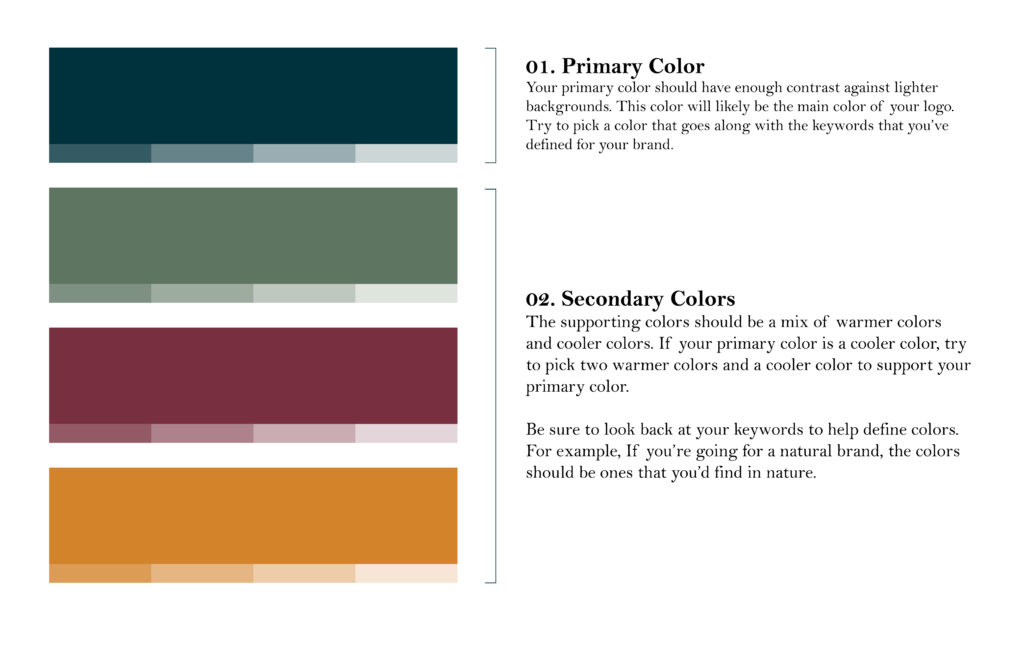
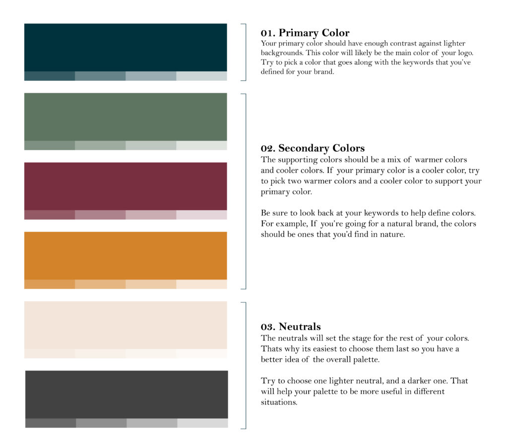
Primary Colors
It’s easiest to start by picking one color that is going to be the main color for your brand. Look back at your keywords to help you out here. Most of the time your primary color is the main color of your logo.
You want a color that is dark enough to have a nice contrast, otherwise you’ll have issues with your customers being able to easily recognize your logo. No pastels here! If you need a lighter color of your color in the future, you can always use a tint of any of your brand colors!

Opposites attract
Want to know a trick about picking colors that go together? Simply put, opposites attract! If you picked a warmer color as your primary (reds, orange, yellows etc) then pick out ones that are on the cooler side(blues, purples, greens) to have a better balance in the palette.
Go ahead and pick out about 3 colors here (remember your keywords!) to round out your palette. Pick a couple cooler colors and a couple warmer ones if you can!
Neutrals
This is where the overall tone rounds out. Here you’ll want to pick a lighter neutral color, and a darker one too. Remember that we want balance in your color palette!
Your neutral colors are the ones that are more in the grey-beige range. They’ll create a nice base for the rest of your colors you’ve already picked.
If your brand has a more vintage/traditional vibe to it, I recommend working more in the warmer (beige/brown) range. If it’s a more modern brand, pull in more cooler, industrial-looking (greys/charcoals). You can even have a warmer neutral and a cooler neutral if you think it fits better with the overall palette.
Picking colors is a series of trials and errors. But eventually, you’ll end up with a color palette that is focused, but well-rounded to use for a wide variety of uses! Then you can get back to running your business like the true boss that you are.
If you’re looking for color inspiration to get started, check out my color Pinterest board to get your wheels spinning!


